by Sarah Bender, Communications Coordinator
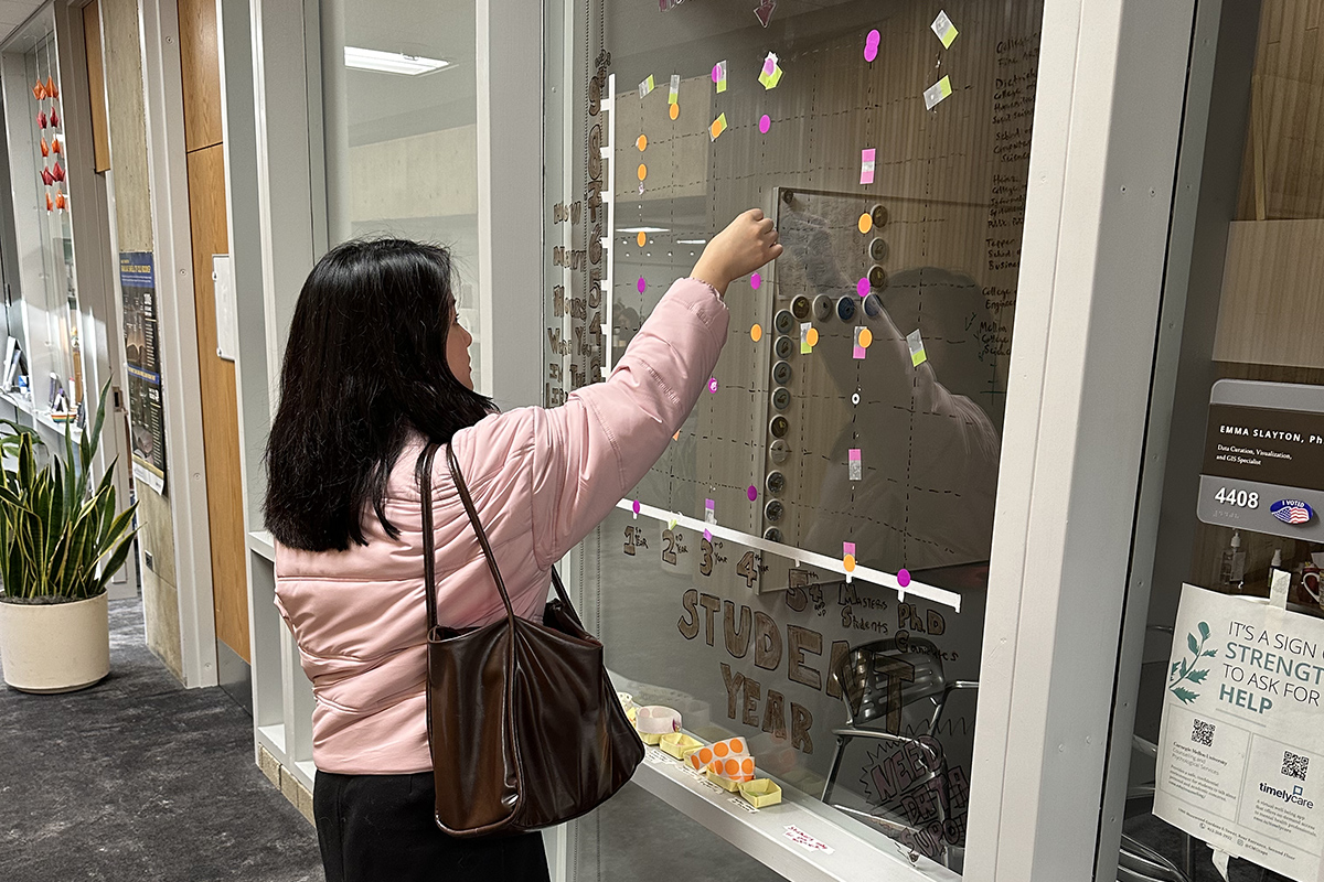
For Data Education Librarian Emma Slayton, it’s critical that students at Carnegie Mellon have the opportunity to explore working with data in an organic, interesting, and community-based way. That’s why she created an interactive installation on the window just outside her office, allowing visitors in Sorrells Library to help shape information gathered about themselves and their peers.
“I wanted to have a space to invite community members who were already in the library to engage with data that might be interesting to them,” Slayton said. “Different disciplines can be kind of siloed at CMU, so the data visualization wall is a great chance for people to see what their fellow students are doing, and what others are experiencing in various colleges across campus.”
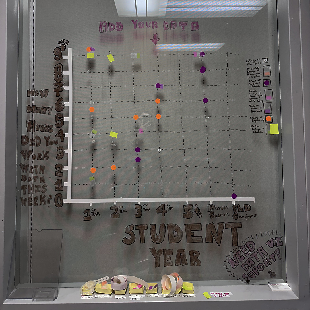
The first question on the giant, handmade graph, posted in the fall of 2023, asked students to share how many hours they spent in Sorrells throughout the past week. Over 80 respondents offered up the number of hours they’d studied at the library — some as many as nine hours or more — along with their school or college and program year.
 During the spring semester, two additional questions collected further data: how many times students interacted with data in the past week, and how many hours they slept last night.
The data visualization wall serves two key purposes. First, it’s a straightforward way for Libraries faculty and staff to learn about the needs of the people who come into the building. “By asking questions students want to answer, we can find out more about those who are using our spaces and how we can best serve them,” Slayton explained.
Most important, however, is the way it encourages students to get involved. By contributing to data collection in a way that’s participatory, not predatory, Slayton said it encourages participants to really think about the many ways researchers can build data. The hands-on method creates an even more approachable environment.
“Students are so used to building visualizations through R or Python, or by using a tool like Tableau,” Slayton added. “But I find that some of the most effective ways to learn about good graph design is doing it by hand, not on a computer screen. That tactile element is a really valuable experience.”
Ultimately, Slayton and the Libraries’ other data specialists aim to increase awareness of the different ways they can assist students working with data. The Libraries’ Data Services, which helps the CMU community manage, share, and protect their data, includes assistance with data visualization. The team offers a number of ways to make the most out of graphs, consultations with students or faculty, and guest lectures in courses around visual analyses.
“If you’re in a class and you’re trying to figure out the best way to visually communicate your research, we encourage you to look into all the ways the Libraries can help,” Slayton said. “We can help you build data stories and communicate them to multiple audiences, so that the information you’re excited to share with others comes across in a way that’s visually engaging and informative.”
Workshops throughout each semester focus on recommended practices and data visualization tools. Coming this fall, the seven part workshop series “Communicating Data and Research Storytelling” will dive into the different ways to build and communicate data stories. Session one, on Wednesday September 4, will give participants a chance to understand how data stories are identified and built. Subsequent sessions focus on graphically creating effective data visualizations, using tools like Tableau and R to build visualizations, and how to communicate data stories to various audiences.
Also in the fall, Slayton will be organizing an Iron Viz competition. At this event, students will have the opportunity to create visualizations around a themed data set.
Participants will also get feedback from experts — instructors who teach data visualization best practices, as well as administrative staff who visualize data for groups like the Board of Trustees. The event is a chance to engage with potential employers and start making connections in data communication before graduation.
Meanwhile, the data visualization wall will continue as a way to give students a fun, low-stakes way to participate in data exploration. To incorporate student input even further, Slayton’s next step is to ask students to provide questions they’re interested in learning the answers to.
To suggest a question, stop by 4408 Wean Hall in Sorrells Library. To get started with other data visualization needs, reach out to Slayton or contact the University Libraries Data and Publishing Services team.
